Iscon Balaji Foods Leverages Strategic Design to Launch Hungritos into the B2C Space
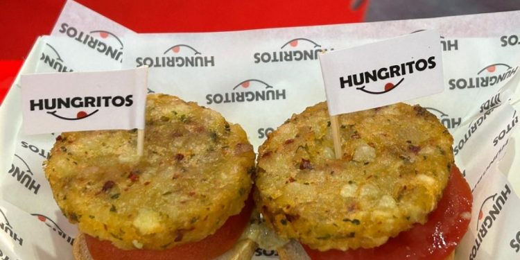
Iscon Balaji Foods, India’s leading potato supplier, has made a significant leap from B2B to B2C by introducing a new frozen snack range under the brand name Hungritos. Tasked with creating an eye-catching visual identity and a compelling packaging graphics system, the Elephant team has successfully positioned Hungritos to stand out on the crowded shelves of the frozen snack market.
The Focus
Iscon Balaji Foods aimed to establish Hungritos as a dominant player in the frozen snack category, featuring products such as French fries, burger patties, and potato shots. The Elephant team’s mission was to design a packaging system that would enhance brand visibility while clearly communicating variant differences, and to develop a visual identity that conveyed a strong brand proposition in a distinctive manner.
The Design
The design team revitalized Hungritos’ visual identity by emphasizing its iconic ‘smile’ element, complemented by contemporary fonts on a clean white background to ensure shelf prominence. The packaging system incorporated cues that reassured consumers about the quality of frozen foods and distinguished the brand from its competitors.
Each product variant is represented by a unique color, contributing to a handcrafted, premium feel. This design strategy not only enhances shelf presence but also builds consumer trust and curiosity.
The Story
Embarking on this dynamic journey, Iscon Balaji Foods transitioned from B2B to B2C with the goal of capturing the frozen snack market. The Elephant team crafted a visual identity for Hungritos that highlighted its brand essence and developed a captivating packaging graphics system to differentiate the brand on store shelves.
Iconic Smile and Visual Identity
The recognizable Hungritos smile, featuring a protruding tongue, became the focal point of the new visual identity. This element, combined with a modern typeface and bold font on a white background, created an approachable and visible brand presence. This playful design stood out in a market often dominated by more serious aesthetics, adding a light-hearted touch to the brand.
Culinary Presentation
Moving away from traditional home-cooking style food photography, the packaging featured gourmet-style presentations. Top-angle “drool shots” displayed the abundance and distinct shapes of the products, setting Hungritos apart from competitors who typically use front-angle or close-up shots.
Myth-Busting Frozen Food
To address consumer concerns about frozen foods, the packaging prominently displayed the message “Frozen for Freshness” and included detailed cooking instructions to ensure perfect results. The back of the pack featured information on the absence of preservatives and the use of fresh ingredients, further building consumer trust.
Shelf Space Strategy
The packaging system was designed to foster brand recognition and variant differentiation. The use of a “torn-note” style font for variant names suggested a personalized, handcrafted recipe, enhancing the human connection. Each variant color dominated the packaging, with a white background band providing a clear canvas for the visual identity. The subtle metallic sheen and vibrant colors ensured visibility even behind foggy freezer doors.
Conclusion
Through strategic design, the Elephant team has enabled Hungritos to make a strong debut in the consumer market. The engaging visual identity and captivating packaging graphics system have established a distinct brand personality, promising a delicious culinary experience. This successful transition from B2B to B2C underscores the power of design in driving brand success. Hungritos is set to conquer the frozen snack category, one delicious bite at a time.


