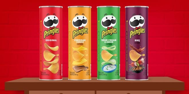
For the first time in 20 years, Pringles has updated its unmistakable can with a fresh, new look that features bold hues and a clean design, highlighting the crisps’ inventive flavors and unique, stackable shape.
To complement the can’s new look, Pringles also streamlined its mustachioed mascot, to better highlight the flavors in every can and showcase its new range of emotions to match.
“We spent the last two years in research and design to create a modern look for the cans and Mr. P’s style that reflects the bold flavor in every Pringles crisp and stack,” said Gareth Maguire, senior director of marketing for Pringles. “While the look may be new on the outside, I’m proud to say that it doesn’t change the irresistible taste that’s always been on the inside of every Pringles can and celebrates the unique snacking experience that is part of every bite.”
The refreshed logo and brand design are featured on Pringles’ new Scorchin’ line arriving in store and online in December, and across all brand communications in early 2021.


