The Evolution of McCain Foods: A Packaging Revolution
In an increasingly competitive food industry, standing out on the shelf has never been more important. McCain Foods, a global leader in frozen potato products, has taken a bold step to solidify its market position by completely redesigning its packaging for the UK and EU markets. This initiative aligns with McCain’s broader global brand refresh and reflects a commitment to consistency, innovation, and consumer connection.
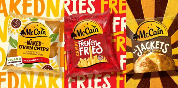
The redesign, executed in partnership with BrandOpus, introduces a modernized visual identity that emphasizes McCain’s iconic Sunshine logo and highlights the brand’s natural and real ingredients.
Key Elements of the Redesign
- Streamlined Identity
At the heart of the new packaging is an enhanced Sunshine logo, now more simplified and iconic. It features prominently across all products, ensuring immediate brand recognition. - Custom Typography
The new bespoke typeface, “McCain Wedgebrush,” is hand-designed to evoke natural brightness and diversity, reflecting the variety within McCain’s product portfolio. Supporting fonts, “Rooney” and “Brother,” complement the design by clearly communicating product details. - Hand-Printed Illustrations
A standout feature is the use of real potatoes to create hand-printed assets, reinforcing McCain’s focus on natural ingredients. This tactile approach provides a unique, artisanal feel to the packaging, connecting with consumers who prioritize authenticity in their food choices.
Why Packaging Matters More Than Ever
Packaging plays a crucial role in consumer decision-making. Research shows that over 70% of purchase decisions are influenced by packaging during in-store shopping. In addition, the European frozen food market has been evolving rapidly, with increasing demand for eco-friendly, visually appealing, and informative packaging. McCain’s redesign not only caters to these demands but also positions the company for long-term growth amidst a challenging market landscape.
The Bigger Picture: McCain’s Growth Strategy
This redesign is part of a larger strategic effort to adapt to shifting consumer preferences. The frozen food sector has experienced heightened interest in sustainable packaging, and McCain’s hand-printed elements and commitment to natural representation align with these trends. By reinforcing its identity through visually cohesive and innovative packaging, McCain is building a stronger connection with its customers.
BrandOpus, the design firm behind the transformation, has a track record of helping brands achieve long-term success. Their previous collaboration with McCain in 2013 resulted in significant growth, and this latest update aims to replicate that success on an even larger scale.
McCain Foods’ new packaging is more than a cosmetic change—it’s a strategic move designed to enhance brand recognition, align with consumer values, and set the stage for future growth. By prioritizing authenticity and consistency, McCain is not only reinforcing its position in the frozen food market but also demonstrating how thoughtful design can drive business success.


